


Direct-to-Film (DTF) printing is a cost-effective solution for apparel decorators, offering impressive results at a relatively low price point. It has quickly become a popular choice in the industry. While the process is beginner-friendly, creating flawless designs that produce optimal prints still requires some skill. In this post, we’ll share five expert tips to help both beginners and professionals design DTF artwork that delivers professional-quality results.
Tip 1: Improve the Hand Feel for a Lasting Impression
One of the key advantages of DTF printing is its naturally softer feel compared to other methods. However, achieving breathable and flexible prints can be difficult with large, solid designs that lack open spaces. To maintain a soft, comfortable finish, it’s important to keep this in mind during the design phase.
Remove Backgrounds
One of the most effective design techniques is background removal, sometimes called “knocking out” the shirt color. Removing backgrounds from DTF designs not only improves visual appeal but also:
- Produces lighter, more flexible prints by reducing ink and adhesive use
- Enhances breathability by allowing the fabric to “show through”
- Creates a more professional look by blending seamlessly with garment colors
- Prevents the stiff, uncomfortable “box” effect on the print
Practical tips for background removal:
- Start with a transparent background in your design software for easy garment integration.
- Use the garment color strategically in your design to enhance overall appearance.
- Incorporate negative space so the shirt color shows through, creating a more breathable result.
- For photos or complex graphics, apply soft edges or fades instead of hard cutouts to achieve a smoother, more natural transition.
Using Halftones
Halftone printing creates an illusion of shading and gradients by varying the size, shape, and spacing of small dots. To the human eye, these dots blend into continuous tones, resulting in images with a smoother and more complete visual effect.
Halftones can:
Add artistic depth and texture to your designsmiešané do súvislého tónu ľudským okom. Výsledkom je obraz s jemnejším a úplnejším vizuálnym vzhľadom.
Reduce the amount of ink used
Improve flexibility and breathability
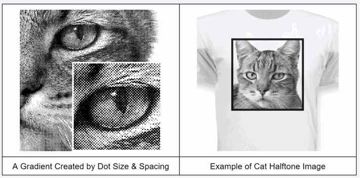
Halftones are a game-changer in DTF printing for several reasons:
Softer feel: Halftones break up areas of solid ink, resulting in lighter, more flexible, and more breathable prints.
Natural blending: Allows patterns to fade seamlessly into the garment color for a more cohesive look.
Enhanced detail: Halftones add depth and texture to your designs, especially in gradients and photographic elements.
Professional finish: When done well, halftones enhance print quality, making designs look polished and ready to sell.
Tip 2: Optimize size and placement for visual impact
Using transfer film in DTF printing allows for versatile garment decoration options. Choosing the right size and placement is essential to creating impactful patterns that will
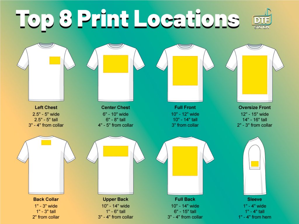
Key Considerations for Size and Placement
When optimizing size and placement, keep these factors in mind:
- Moderation matters: Avoid overly large designs that overpower the garment; modest sizing often looks more professional.
- Adapt to garment sizes: Adjust your artwork for different sizes, from youth to 3XL adult.
- Mind print areas: Pay attention to standard print zones (chest, full front, and back) and how scale affects placement.
- Improve breathability: Smaller prints allow for better airflow, ensuring greater comfort.
- Preserve flexibility: Modest-sized prints keep the garment’s natural drape and movement.
- Aim for visual balance: Choose designs that complement the garment rather than dominate it.
- Check graphic quality: When enlarging raster graphics, ensure clarity to avoid soft or pixelated edges.
Tip 3: Boost Vibrancy for Eye-Catching Designs
Many apparel decorators love DTF printing for its vibrant results—but without well-prepared design files, you may not achieve the desired brightness. Here are some fundamental tips to ensure your colors meet business and customer expectations:
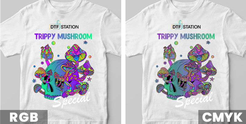
RGB vs. CMYK: Choosing the Right Color Mode
- RGB is an additive color model used for digital screens, blending red, green, and blue light to create bright, vivid tones.
- CMYK is a subtractive model used in printing, where colors are created by removing light, often producing flatter or less intense shades.
Because most designers work in RGB while printers rely on CMYK, selecting the correct color mode is essential to achieving the vibrancy you want.
⚠️ A common mistake is converting RGB files to CMYK within graphic software, which can dull your prints. Always verify how your RIP (Raster Image Processor) handles color profiles to preserve brightness and consistency.rne používajú CMYK, výber správneho farebného režimu je rozhodujúci pre dosiahnutie požadovanej živosti. Jednou z bežných chýb, ktorým sa treba vyhnúť, je prevod súboru RGB na CMYK v grafickom softvéri, pretože to môže viesť k menej žiarivým výtlačkom.
Additional Tips for Correct Color Files
To ensure your files are set up with the appropriate color mode:
- Work in RGB: Start your design process in RGB mode to take full advantage of its wider color gamut, allowing for brighter and more varied colors.
- Preview in CMYK: Always check your design in CMYK mode to see how colors will shift in print, ensuring you’re prepared for the final output.
- Save files in sRGB: Save your DTF files in the standard sRGB format and let professional RIP software handle conversion to CMYK for optimal color reproduction and vibrancy.
- Vector vs. raster designs: If your design is vector-based and started in CMYK, submit it as-is to preserve color integrity. For raster images in CMYK, convert to sRGB before adjusting levels to achieve the best results.
Adjusting Color Settings (Brightness, Contrast, Levels, Curves, etc.)
Effective color enhancement often requires adjusting image settings. Consider the following adjustments to maximize vibrancy:
- Brightness: Adjusts the overall lightness or darkness. Increasing brightness can make colors pop, but too much can wash out details.
- Contrast: Controls the difference between light and dark areas, adding depth and making colors appear more vivid. Excessive contrast can disrupt overall color balance.
- Levels: Fine-tune shadows, midtones, and highlights to enhance tonal range and overall vibrancy.
- Curves: Offers precise control over tonal adjustments, allowing subtle changes to brightness and contrast without uniformly affecting the entire image.
- Vibrance: Increases the intensity of less saturated colors more than already vivid ones, enriching the palette without overwhelming the design. Typically, you can increase vibrance by 50% or more safely.
- Saturation: Intensifies all colors, but too much can produce unrealistic results. A general guideline is a 10–20% increase, using vibrance first to enrich colors while moderating saturation to prevent oversaturation.
Rich Black
A rich black is crucial for vibrant prints. Achieve it by mixing different CMYK inks, resulting in a deeper black than using K (black) alone.
- Vector files: Use CMYK sliders to blend inks for a fuller effect, but avoid maxing out all four inks to prevent bleeding.
- Raster images (sRGB): Adjust levels for fully saturated blacks while maintaining vibrant midtones.
- Selective color: Use this tool to inject additional colors into black areas for added depth.
Tip 4: Preserve Fine Details and Lines
One of DTF printing’s main advantages over other methods is its ability to capture intricate details and fine lines. DTF prints produce sharp lines, complex patterns, and subtle shading—perfect for detailed text, logos, and intricate designs.
Choose the Right File Type: Vector vs. Raster
The file type you use significantly impacts print quality and vibrancy. There are two main categories:
Raster files (PNG, JPEG, TIFF): Comprised of pixels, suitable for photographic designs, but scaling beyond their original resolution may reduce clarity.vrhy s plnými farbami a ostrými čiarami. Naproti tomu rastrové súbory (JPEG, PNG, TIFF) pozostávajú z pixelov a sú vhodnejšie pre detailné obrázky a fotografie, ale ich kvalita závisí od rozlíšenia, ktoré sa môže pri zmene mierky zmenšiť.
Vector files (AI, EPS, PDF): Use mathematical points, allowing infinite scaling without loss of quality, making them ideal for full-color designs and detailed line work.
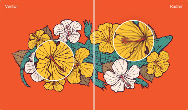
To achieve optimal results, always use vector files whenever possible, especially for full-color designs and text.
If you choose raster files, select high-resolution formats such as PNG or TIFF to preserve detail and vibrancy. Avoid GIFs, as they are limited to 256 colors and do not provide the quality needed for high-quality DTF prints.
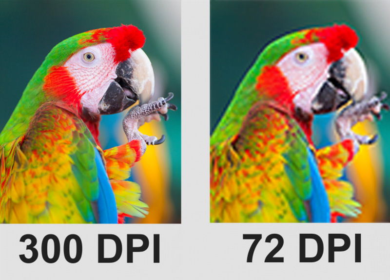
Recommended Design Resolution for DTF Transfers
Creating sharp and vibrant DTF prints depends heavily on selecting the correct image resolution.
- Higher resolutions, measured in DPI (dots per inch), provide greater detail.
- Lower resolutions can result in blurry or pixelated prints.
For DTF transfers, the industry standard for high-quality output is 300 DPI, ensuring precise detail and vibrant color reproduction.
PrePerform a Quality Check Before Printing
After applying all the previous tips, you may have stunning designs ready for print, but it’s always wise to perform a final quality check. Ensuring that all fine details transfer correctly is critical for achieving professional results.
Although DTF printing handles intricate elements well, avoid including design components smaller than 0.02 inches (0.5 mm), as they may not print accurately. A helpful trick is to use a 0.02-inch circle as a reference—any part of your design that completely overlaps this circle may not reproduce successfully. This quick check helps maintain the sharpness and clarity of your final print.
Tip 5: Follow Universal Design Principles
The previous four tips focus on enhancing your design effects, but before applying them, it’s even more important to create a design where all elements blend seamlessly for a cohesive, eye-catching garment.
If you use original, unique designs for your business, adhering to universal design principles ensures that your artwork remains professional and visually harmonious. Keep the following guidelines in mind:
- Simplify the design: Focus on key elements by identifying and emphasizing the most critical parts, such as central images, logos, or text. Remove unnecessary details to improve readability and impact.
- Bold outlines: Use thick outlines to create strong contrast and make elements pop, especially on busy backgrounds. White outlines can enhance visibility on darker surfaces, giving a “sticker-like” effect for dramatic visuals.
- Composition: Arrange elements effectively to create visual balance and guide the viewer’s eye.
- Typography: Choose fonts thoughtfully, pair them appropriately, and ensure layout readability and appeal.
- Color theory: Use color wheels, complementary colors, and color psychology to create visually striking designs.
- Branding: Build consistent, recognizable brand identities across products.
- Visual hierarchy: Highlight key elements and organize information to improve communication within your design.
- Negative space: Use empty space strategically to emphasize key elements and achieve cleaner, more professional designs.
Additional Resources for Free DTF Design Files
For businesses with in-house design teams, the tips above will help create flawless DTF designs. For those without a design team, free DTF design files are a valuable resource. While many websites offer free images, only some allow commercial use. Here are some top sources to safely find and download images (always check licensing before use):
- Wikimedia Commons – Public domain images from Wikipedia
- Flickr Commons – Public domain collections
- British Library Collection on Flickr
- Official SpaceX photos on Flickr
- Getty Search Gateway
- Met Collection
- Smithsonian Open Access
- New York Public Library Digital Collections
- Library of Congress free-use files
- National Gallery of Art Open Access (USA)
- Rijksmuseum (Netherlands)
- Yale University Art Gallery
- Europeana – European digital library
- Old Book Illustrations & New Old Stock
- Unsplash, Pixabay, Pexels
Conclusion
Creating DTF designs that sell is about combining creativity with strategic techniques. By improving hand feel, optimizing size and placement, boosting vibrancy, preserving details, and following universal design principles, you can create designs that truly resonate with your audience. Every detail matters when making an impression. Remember, the journey doesn’t end here—continuous improvement is the key to long-term success.